Reboot Gut — Rebuilding a Wellness Brand's Website from the Structure Up
A UI/UX case study on turning a scattered, low-converting site into a system-driven, responsive experience.
Role | UI/UX Designer — end-to-end, solo |
Client | Reboot Gut — gut health, nutrition & wellness |
Responsibilities | Discovery, IA, wireframing, UI design, design system, dev handoff |
Tools | Figma, Obsidian, NotebookLM, ChatGPT, Google Meet |
Timeline | ~50 hours · discovery → developer handoff |
Deliverables | 10+ responsive pages, full component library, dev-ready Figma file |
Overview
Reboot Gut is a nutritionist-led wellness brand founded by Manpreet Kalra, blending modern nutritional science with Ayurvedic principles across gut health, nutrition, weight, hormones, sleep, immunity, skin, hair, and metabolism. Their existing site couldn't carry that breadth — content was scattered, the visual hierarchy was flat, and key journeys like lead generation were broken or missing.
I rebuilt it end-to-end: auditing the old site, restructuring the information architecture, defining a reusable design system, and designing 10+ responsive pages handed off fully connected to a component library. The result is a coherent, navigable experience with rebuilt lead-gen and SEO flows — delivered in ~50 focused hours through a tight, review-driven cadence with the client.
The Challenge
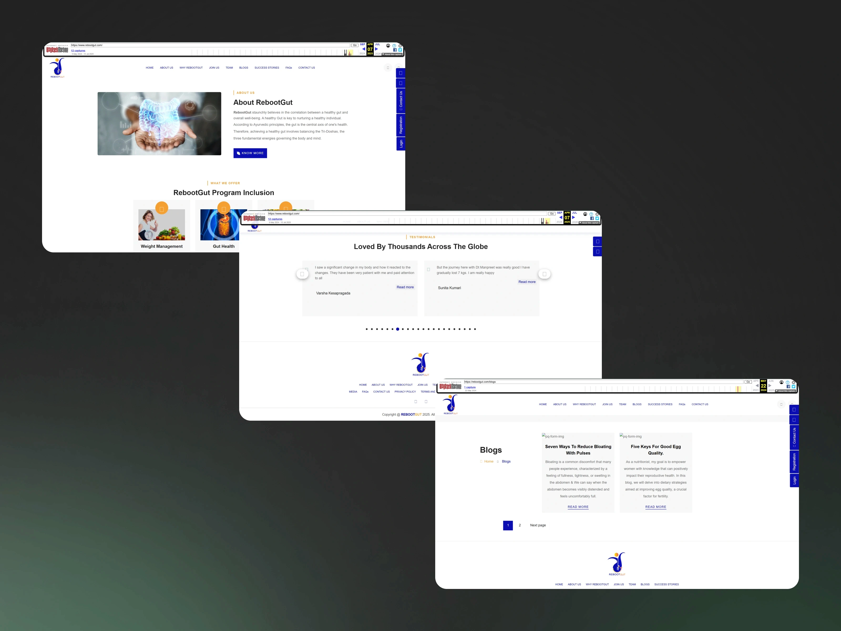
A content-rich, multi-topic health brand had been squeezed into a structure that couldn't hold it. Auditing the live site surfaced four core problems:
Scattered information. Content existed but had no organizing logic. Users couldn't build a clear picture of what Reboot Gut offered or find what was relevant to them.
Flat visual hierarchy. Everything carried equal weight, so nothing stood out — the brand read as thin despite a deep offering.
A broken lead-generation flow. There was no clear path from "interested" to "in touch," so the site under-converted on its primary business goal.
Missing SEO and supporting journeys. Structural gaps left the site hard to discover and several expected flows incomplete.
The real problem wasn't visual polish — it was that the site's structure couldn't support the brand's breadth. So I started there, not with pixels.
What I set out to fix (design goals): clear the information clutter with a real hierarchy, rebuild a friction-free path to booking a consultation, strengthen trust signals (credentials, structured testimonials, social proof), and make every page responsive — all while giving the brand a system it could grow on.
My Process
01 · Discovery & audit
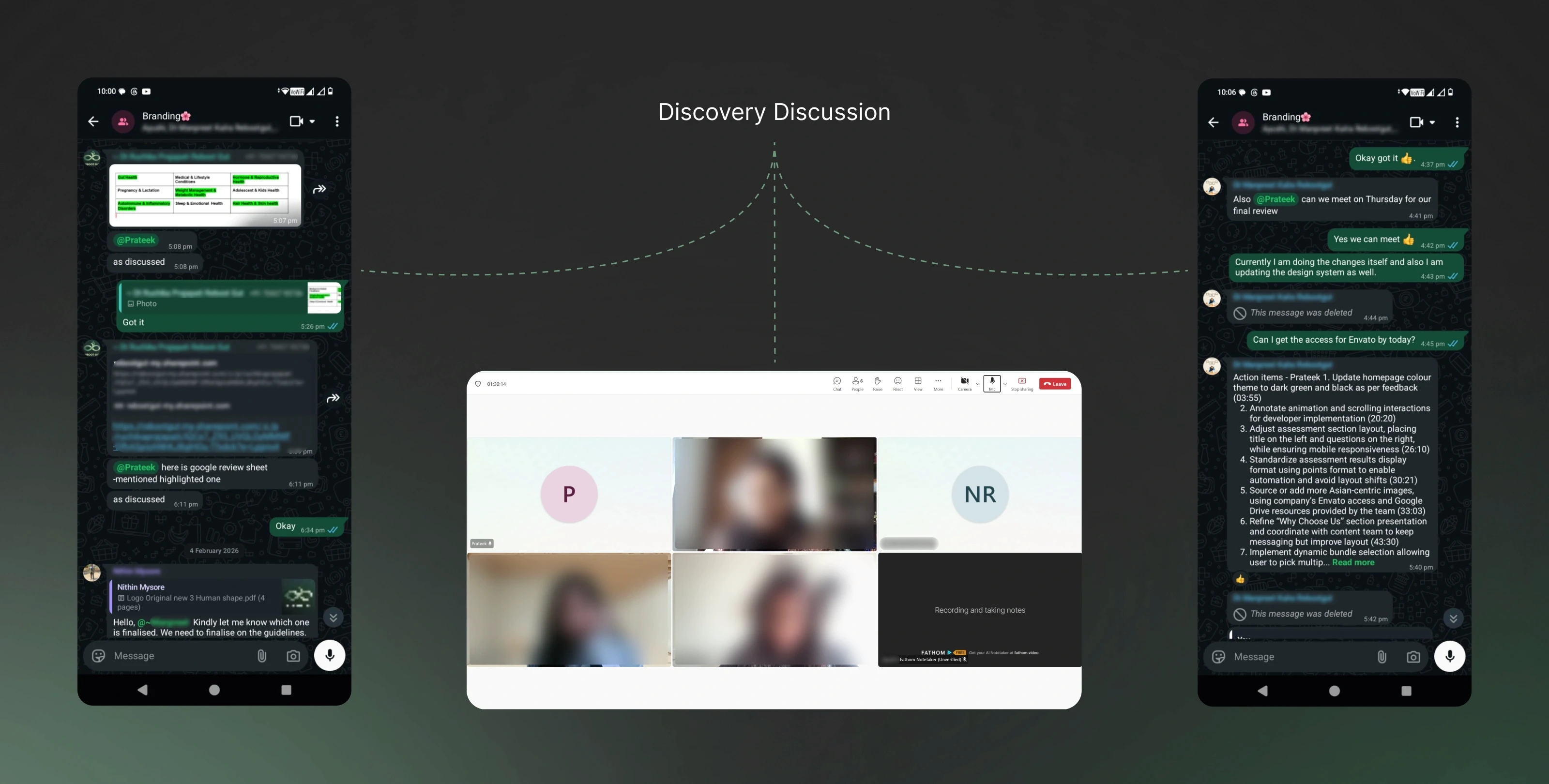
I gathered every requirement and asset the client had, then ran a hands-on audit of the live site — mapping exactly where it broke down and where the highest-impact improvements sat. This turned vague dissatisfaction into a concrete problem list I could design against.
02 · Scope & alignment
I translated the audit into a defined project scope and walked the client through it to lock agreement before design began. Confirming scope up front meant later reviews refined the work instead of relitigating direction — the single biggest reason a content-heavy site came together in a tight timeline.
03 · Single source of truth
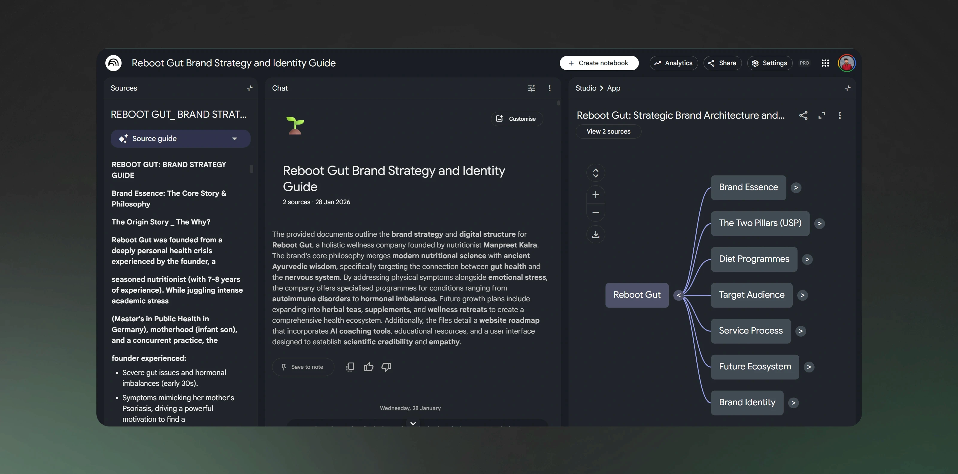
Using ChatGPT and NotebookLM to synthesize research and Obsidian to document it, I built one consolidated source-of-truth covering all company details and offerings. From it, I structured the brand into a clear architecture — brand essence, the two core pillars (USP), diet programmes, target audience, service process, brand identity, and a future ecosystem — so every design decision downstream traced back to a defined part of the brand rather than drifting.
04 · Users & information architecture
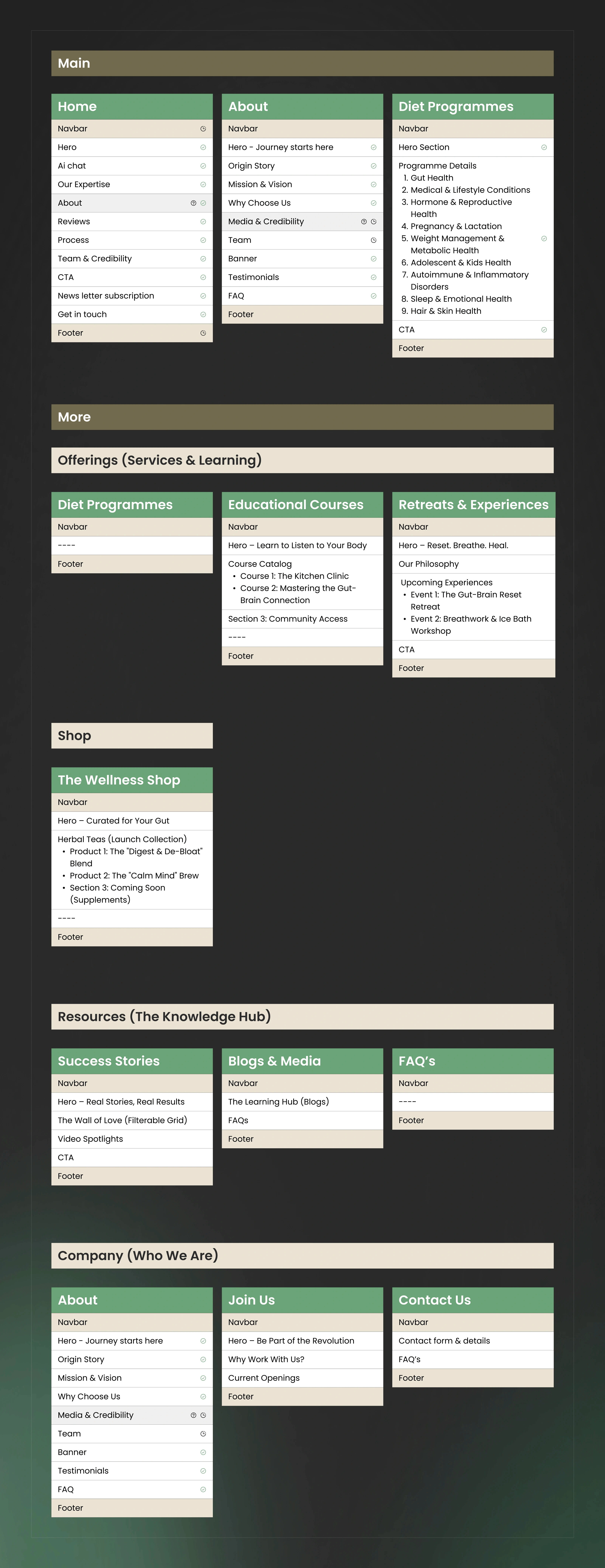
A dedicated session focused on the target audience and their needs. I defined three primary personas to design against — the Health-Conscious Professional (28–40, time-poor, wants scientifically-backed guidance and online consultations), the Wellness Enthusiast (22–35, social-first, driven by transformations and brand personality), and the Concerned Parent (35–50, credential-driven, optimizing family health). With that grounding, I built the sitemap and IA — giving the scattered content a clear, navigable spine and directly solving the site's core structural problem.
05 · Low-fidelity wireframes
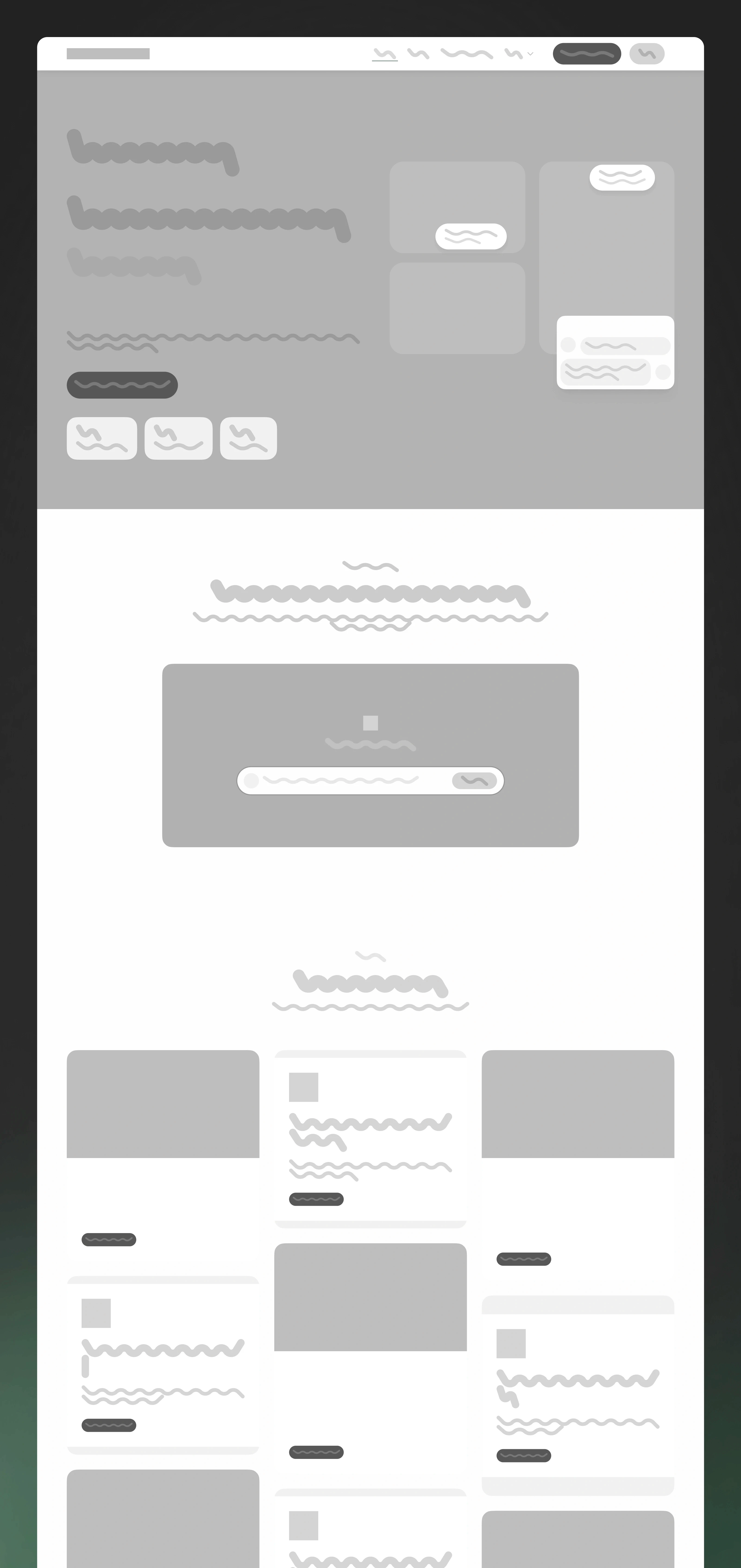
I translated the IA into low-fi wireframes to settle layout and flow before any visual decisions — keeping early feedback about structure, not aesthetics.
06 · Look & feel → design system
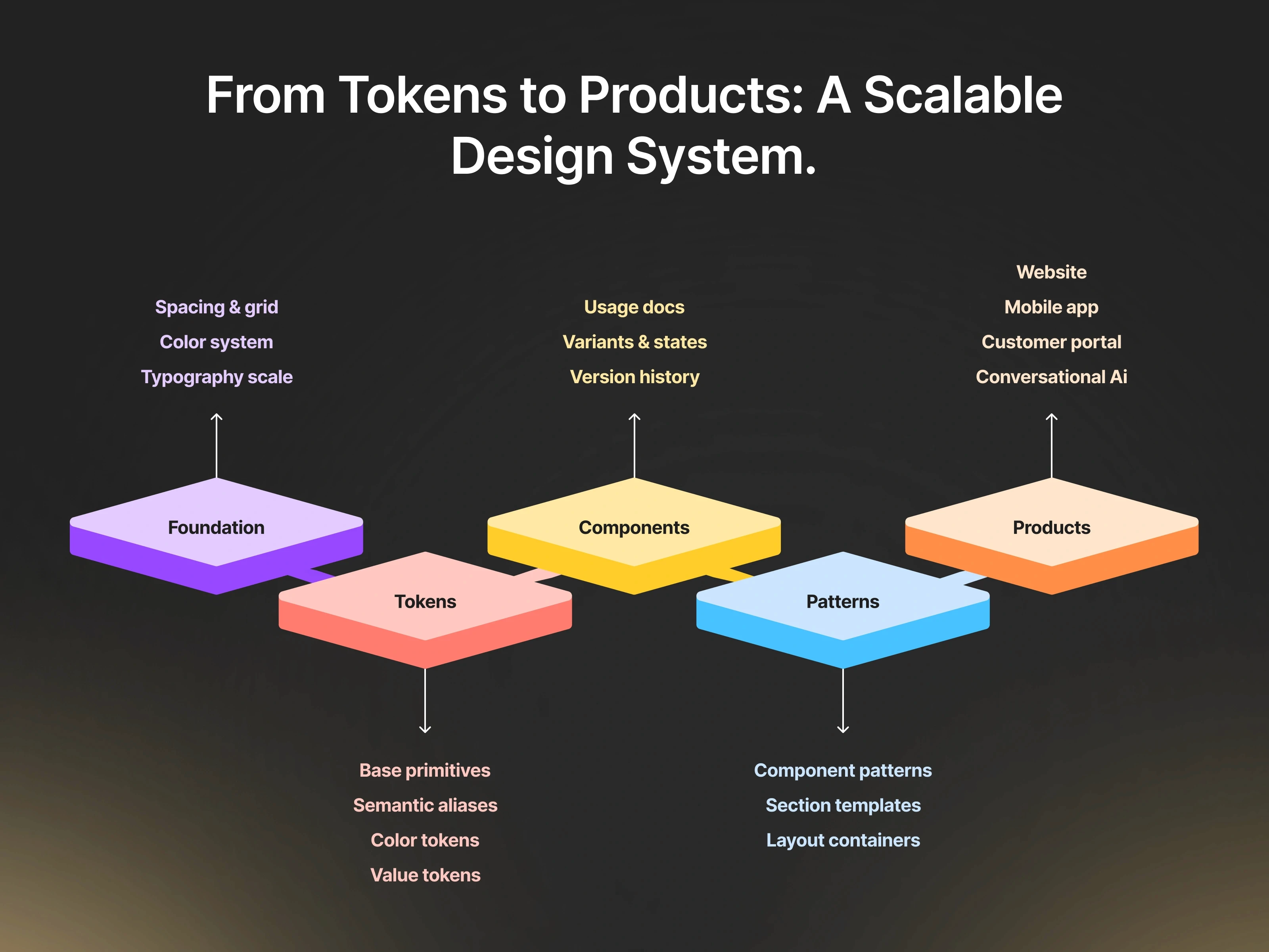
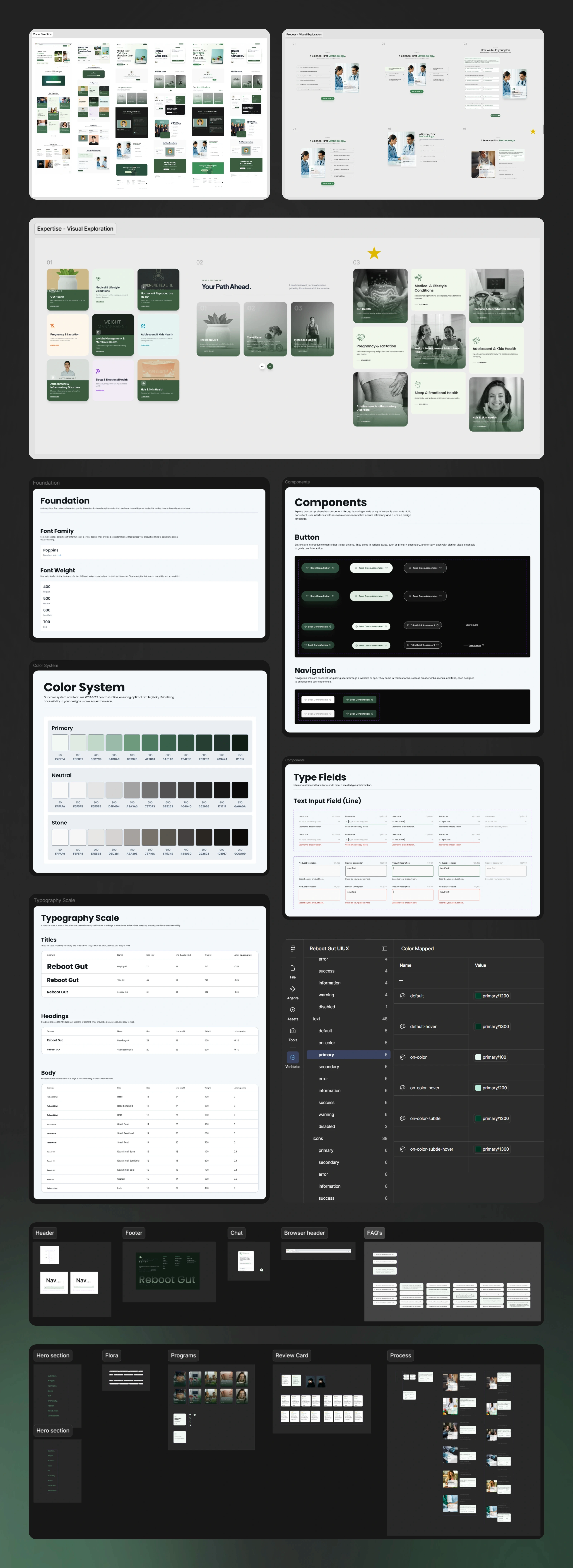
Before committing to a visual language, I presented multiple directions and we finalized the look and feel together. Only then did I build the component library, typography, colors, and variables — so the system was engineered toward an agreed direction rather than reworked after the fact. Concretely, I established a clear type hierarchy (H1 → H2 → H3 → body with deliberate scale and line-height), a wellness-oriented color system with defined roles (primary, secondary, neutral, and accent), and reusable components with consistent spacing and states.
07 · UI design with a built-in review cadence
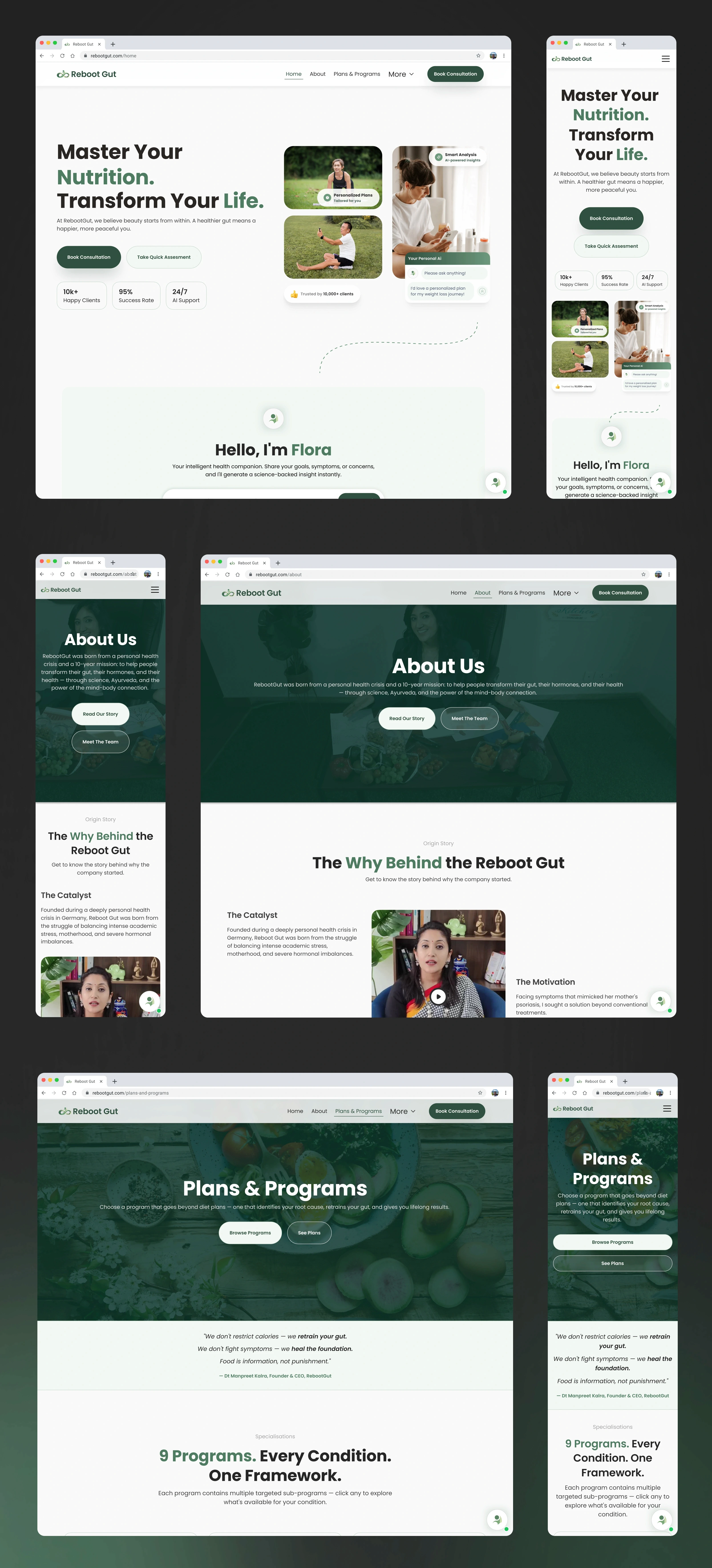
I designed 10+ pages one at a time, holding a review every two or three pages: what worked, what didn't, what to cut, what to add. This rhythm replaced the risky "big reveal" with steady, low-surprise iteration. Every page was designed responsively across mobile and additional breakpoints.
08 · Developer-ready handoff
At handoff, everything was wired to the component library — typography, colors, and components connected, with the necessary variants and props in place — so the dev team could build directly from the system with minimal ambiguity or back-and-forth.
Outcomes
10+ pages designed end-to-end, fully responsive across mobile and additional breakpoints
A complete, connected design system — components, typography, colors, and variables — handed off with variants and props ready for development
Restructured information architecture that resolved the scattered-content problem and made a multi-topic offering navigable
Rebuilt lead-generation and SEO flows, plus previously missing journeys, closing the gaps that limited the old site
5–10 client meetings and multiple iteration rounds, giving the client continuous visibility and sign-off
Delivered in ~50 focused hours, discovery through handoff
What This Project Shows About How I Work
I solve structure before surface. The instinct to fix a "bad-looking" site with visuals is common — and wrong here. Diagnosing the real problem as architectural is what made the redesign work.
I design systems, not just screens. A connected component library with variants and props isn't a nice-to-have at handoff — it's what lets a design survive contact with development.
I de-risk with process. Locking scope, maintaining a source of truth, and building a review cadence turned a broad, ambiguous brief into a predictable delivery.
I work AI-native without losing rigor. ChatGPT and NotebookLM accelerated research and IA; Obsidian kept it documented; Figma kept the build system-driven. Speed, without cutting the thinking.