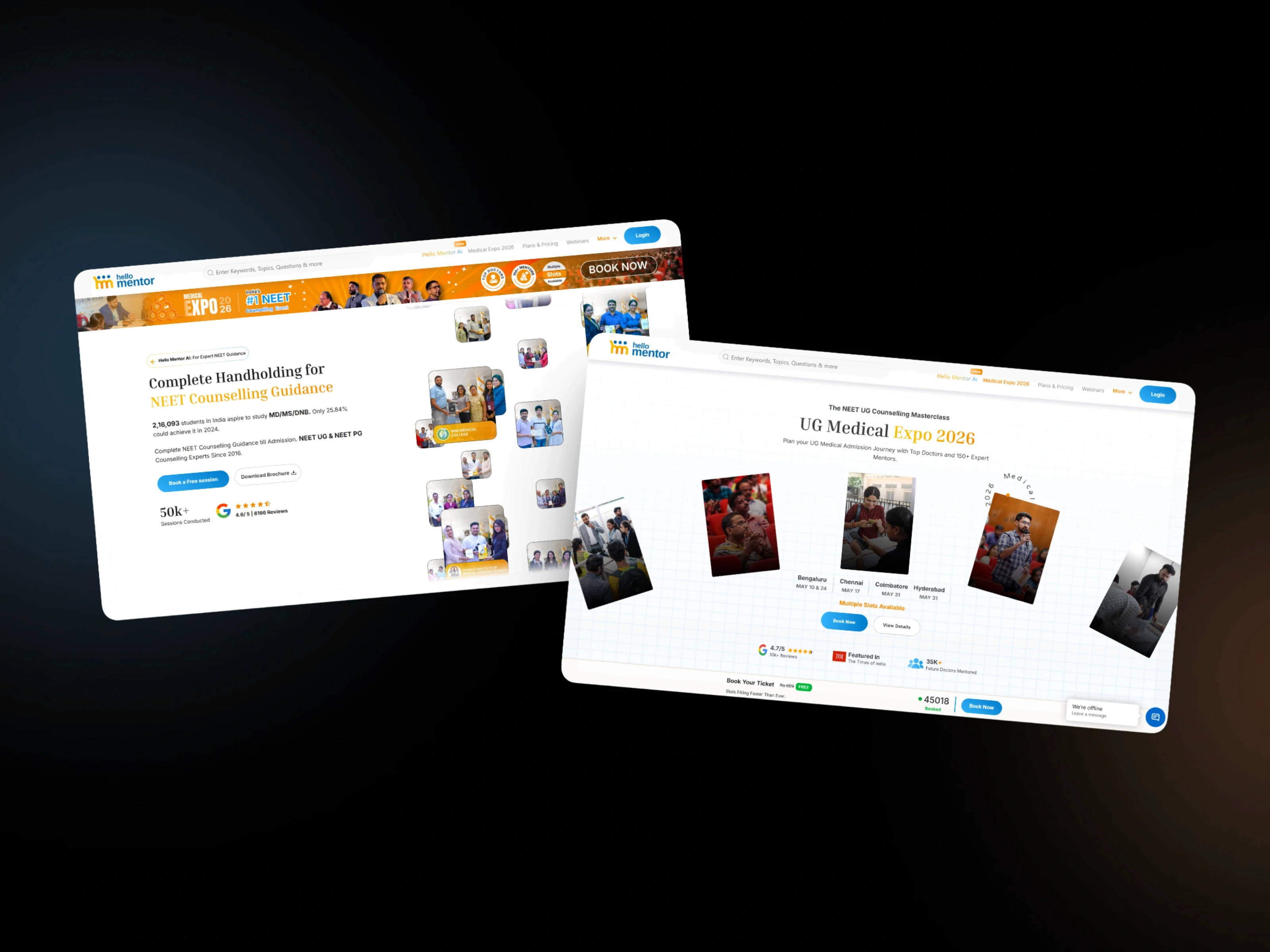
Hello Mentor AI
An AI-powered guidance platform that gives NEET aspirants instant, trustworthy answers — right when the stakes are highest.
Role: Founding / End-to-end Product Designer, Hello Mentor · Experience: 3 years · Scope: Research, synthesis, product concept, information architecture, interaction design, full design system, visual design, and ongoing collaboration with engineering post-launch.
Overview
Hello Mentor helps students navigate NEET counseling — the process that decides which medical college a student ends up in after India’s largest medical entrance exam. The counseling system runs on strict deadlines, shifting quota rules, and multiple admission rounds, and it produces real confusion and real anxiety for the roughly 2.4 million students who go through it every year.
I designed an AI-powered layer for the platform that answers common counseling questions instantly and accurately, so mentors could spend their limited time on the judgment calls that actually need a human — not repeating the same answers every week.
My role
I owned this end-to-end: research with students and mentors, synthesizing that research into a workable product concept, defining the information architecture and core interaction patterns, building wireframes through to a full production design system, and staying embedded with engineering as the underlying AI system matured well past its first release.
Research: understanding the problem before designing anything
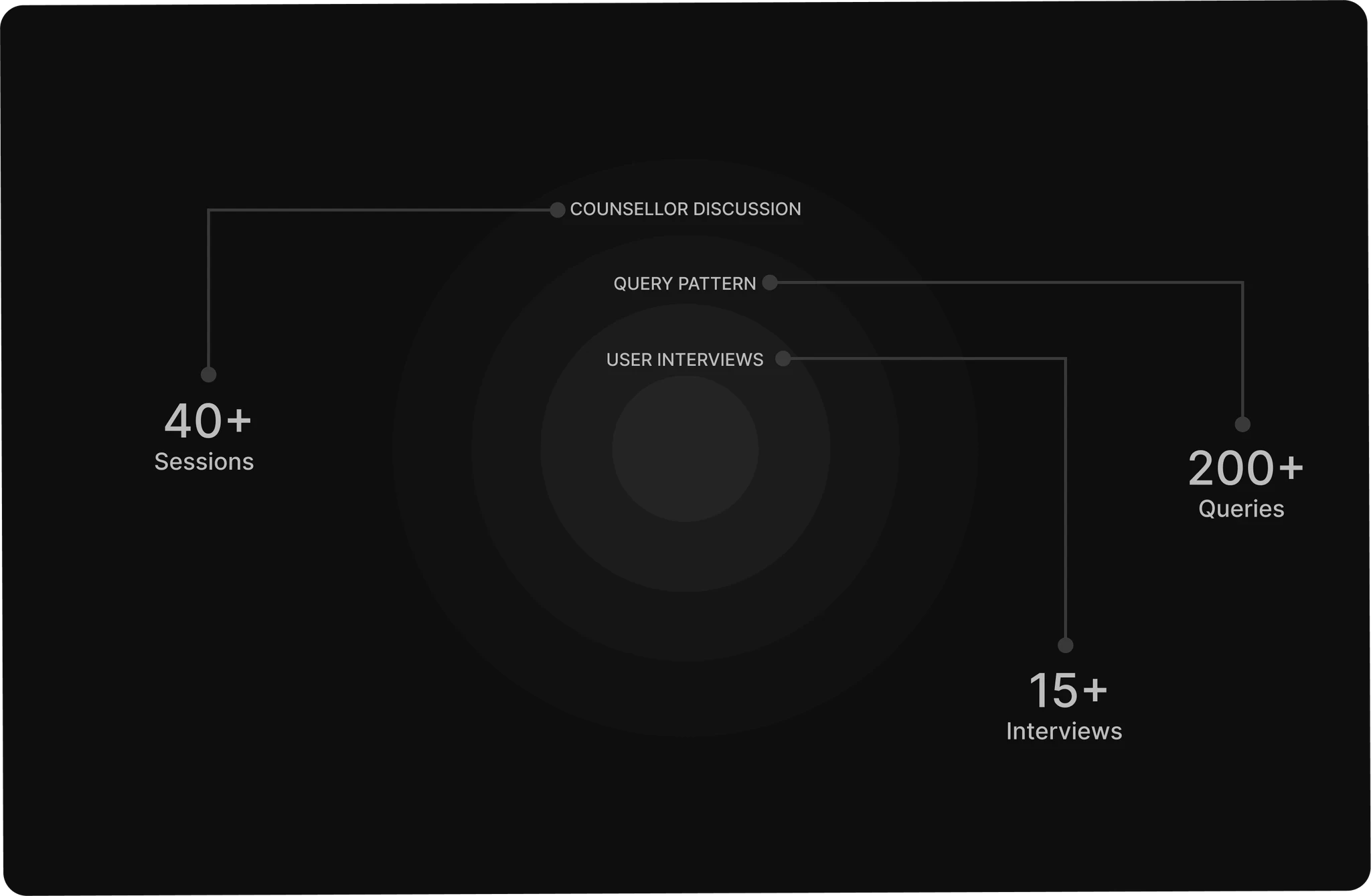
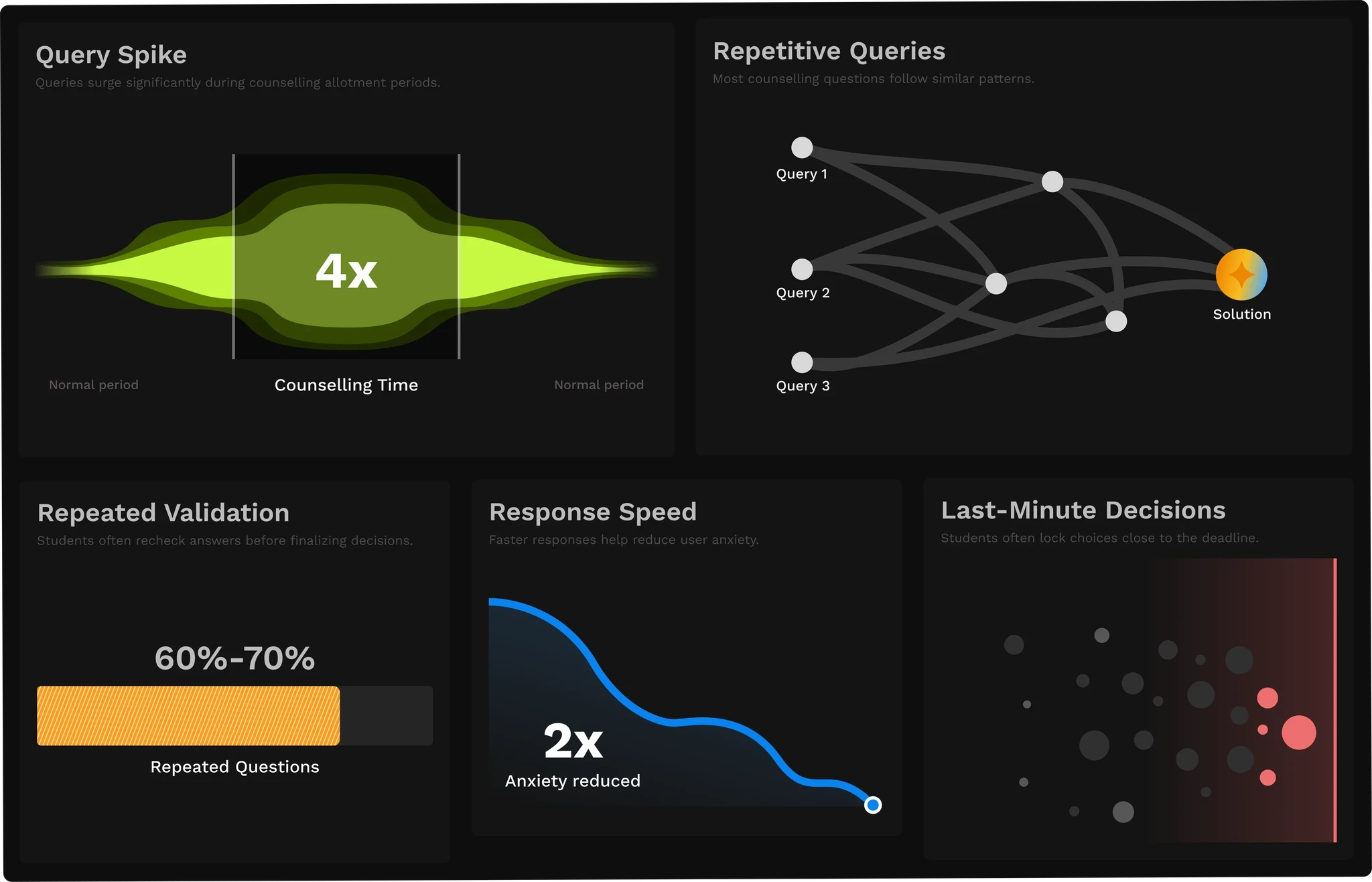
I didn’t start with screens. I started by sitting inside months of webinar transcripts, support tickets, and mentor conversations during peak counseling season, alongside direct discussions with mentors themselves. The goal was to separate two very different things that were getting tangled together: structured, repetitive queries that didn’t need a human, and high-impact, judgment-based decisions that absolutely did.
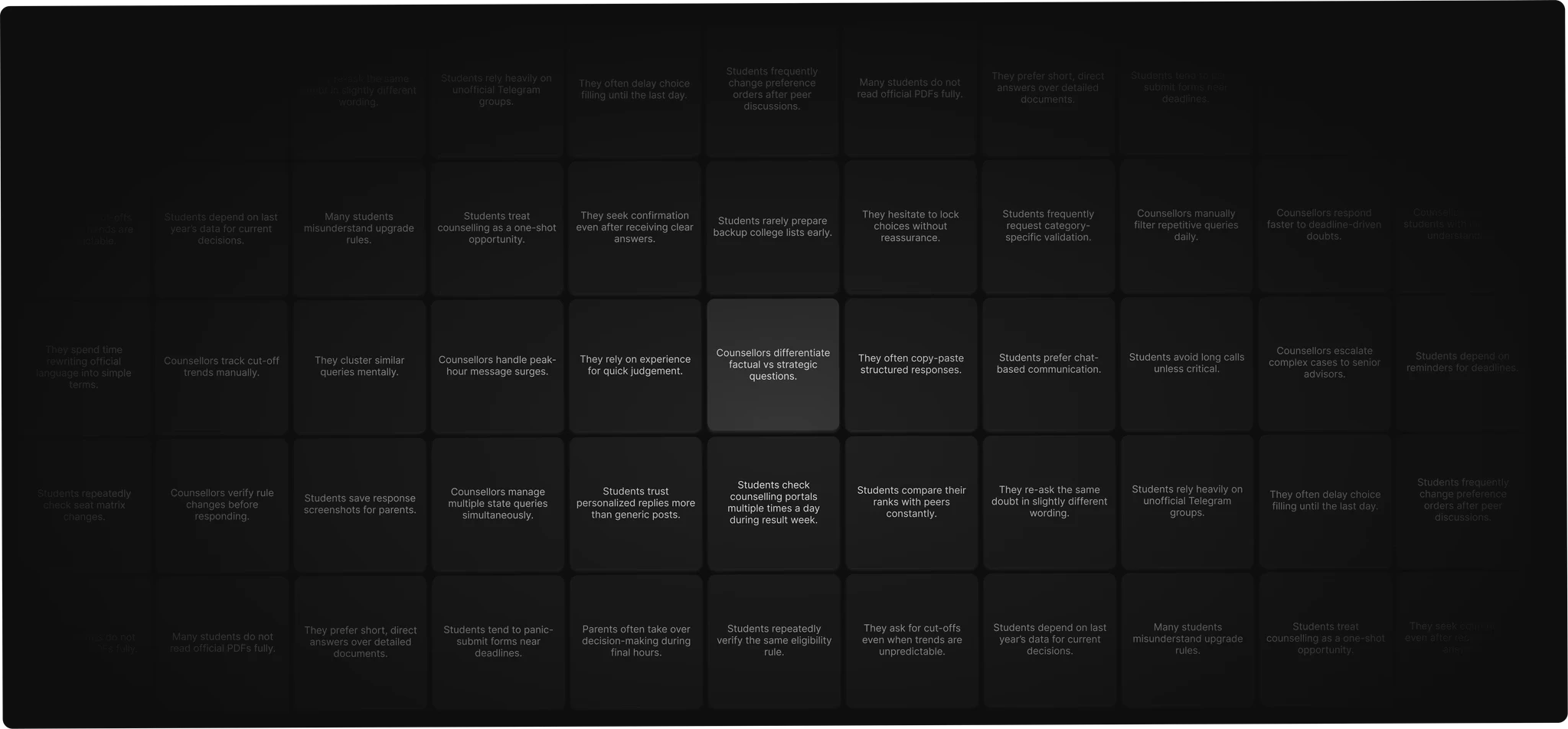
That process surfaced 243 distinct raw insights — behavioral patterns, emotional triggers, and operational bottlenecks — which I clustered into a smaller set of clear themes: information-clarity gaps, deadline-driven anxiety, repetitive structured queries eating into mentor time, and hard limits on counselor bandwidth during peak weeks.
A few concrete patterns stood out immediately:
The same handful of questions came up in nearly every session — “Can I get into X college with my rank?” “Can I sit for both MCC and KEA?” “Does my certificate need to be in English?” — mentors answering the same things, live, over and over.
Cross-referencing feedback from the CX, support, and webinar-hosting teams — which had never been looked at side by side before — showed all three converging independently on the same gaps: stale cutoff and seat data, coverage skewed heavily toward South Indian states, no self-serve fee comparison, no document checklist.
Rank-predictor discrepancies came up as the single largest source of frustration in support data.
One example crystallized the actual risk for me. A college’s cutoff rank showed as roughly 73,000 in one counseling round and roughly 6,900 in another for the same institution — both numbers technically correct, but one was an NRI-quota rank and the other general merit, shown without quota or year grouping. To a student, that doesn’t read as a data-presentation bug. It reads as “the AI is making things up.” That distinction — correct data vs. trustworthy presentation — shaped almost everything that followed.
Research statement: two people, two very different pressures
Synthesizing the research came down to two personas whose needs had to be solved together, not separately:
The student — a NEET aspirant overwhelmed by complex counseling rules, anxious about hard deadlines, afraid of making an irreversible decision without clear guidance.
The mentor/counselor — managing peak-season query overload while trying to protect enough time and attention for the complex, judgment-based mentoring that actually needs a human.
Dual goals
User goals — Students and parents needed immediate, reliable clarity during deadline-driven counseling rounds where academic, financial, and career stakes were all live at once. They needed accurate answers on eligibility, quota applicability, and cutoffs — delivered fast and without ambiguity, since delay or vagueness directly increased stress and decision fatigue.
Business goals — The platform needed to scale support capacity through sharp, deadline-driven spikes in query volume without scaling operational cost the same way — while protecting mentor bandwidth for the cases that actually needed human judgment, and strengthening overall trust in the platform rather than diluting it with an AI layer that felt unreliable.
The reframe
The brief I was originally handed was, in effect, “build an AI chatbot.” I pushed back on that framing early. A chatbot optimizes for answering questions. Our users weren’t asking questions in isolation — every question was really a proxy for “am I making the right call here?” So I reframed the design problem as:
How do we put years of verified mentor judgment in a student’s hands at the moment they need to decide something — without it feeling like an opaque black box they just have to trust?
That reframe is what turned this from a support-deflection feature into an actual product.
How the system works, in plain terms
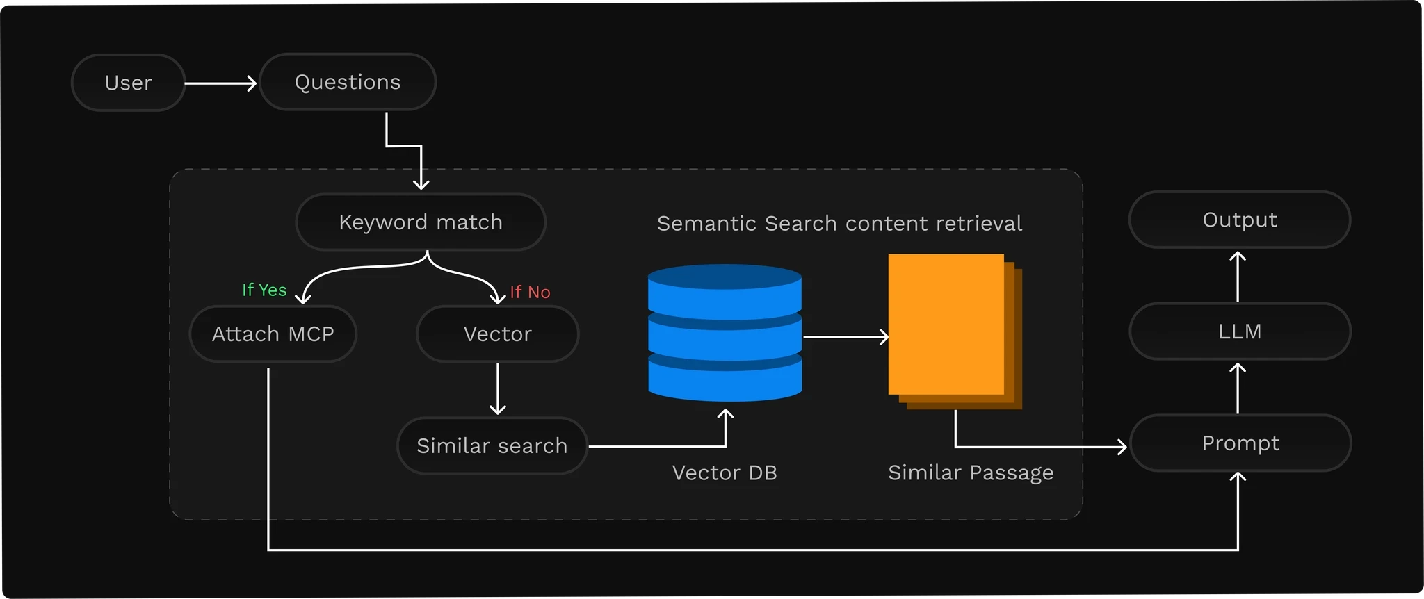
Understanding the underlying architecture mattered for the interaction design, so a short explanation of how it actually answers a question:
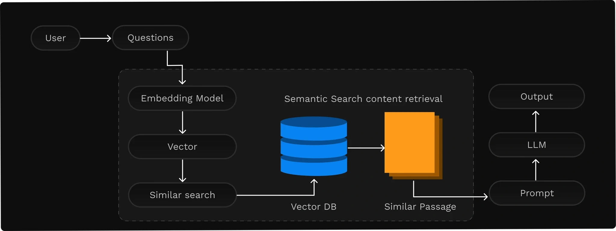
Retrieval-Augmented Generation (RAG). Rather than answering purely from what the model was trained on, the system first retrieves relevant passages from a verified knowledge base — real counseling policy documents and structured data — and only then generates a response grounded in that retrieved content.
Vector search.
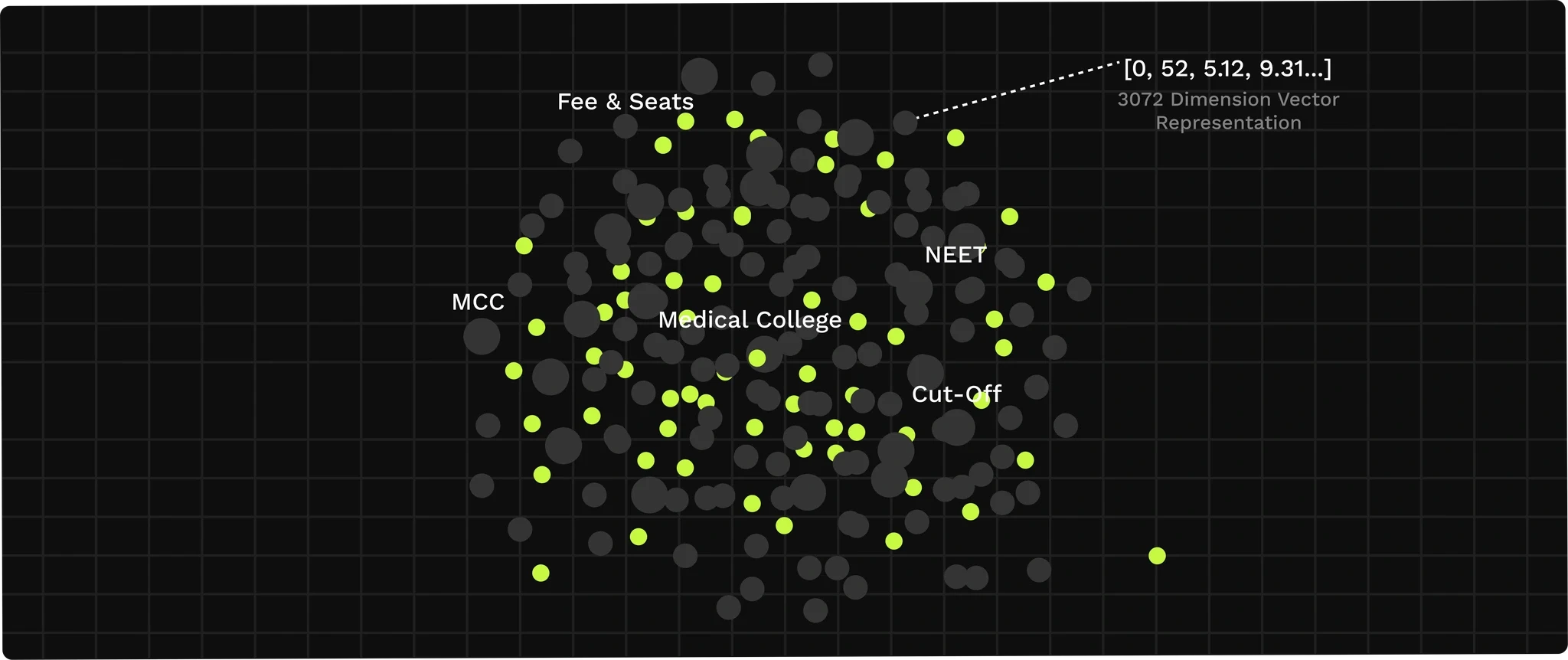
A user’s question is converted into an embedding and matched against a database of verified counseling knowledge by semantic similarity; the closest matching passages get pulled into the prompt the model actually answers from.
MCP tool-calling.
For structured questions — a specific cutoff, a specific fee — the system checks whether a defined tool can answer directly from live data, rather than relying on the language model to “remember” a number it should instead be looking up.
Designing with this in mind meant treating “where did this number come from” as a first-class UI concern, not an engineering detail I could ignore.
Information architecture and user flow
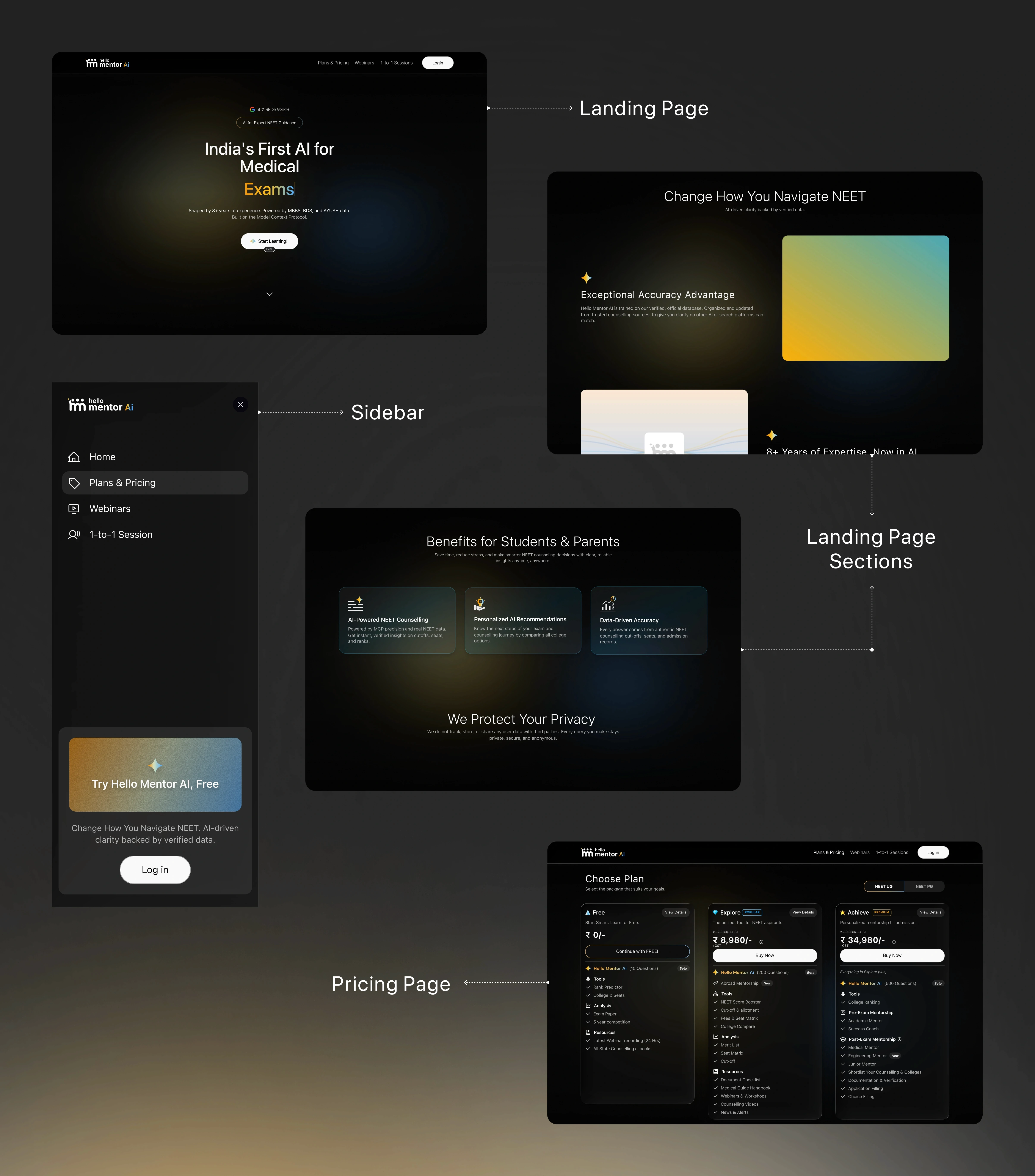
I designed the navigation around a simple principle: not everyone arrives with a question already formed, and for genuinely high-stakes decisions, escalating to a human should be a normal, obvious action — not a buried fallback. New Chat, Discover, Webinars, and 1-to-1 Sessions sit at the same level in the sidebar as equal front doors into the product, following familiar navigation patterns so the flow between core actions stays low-friction.
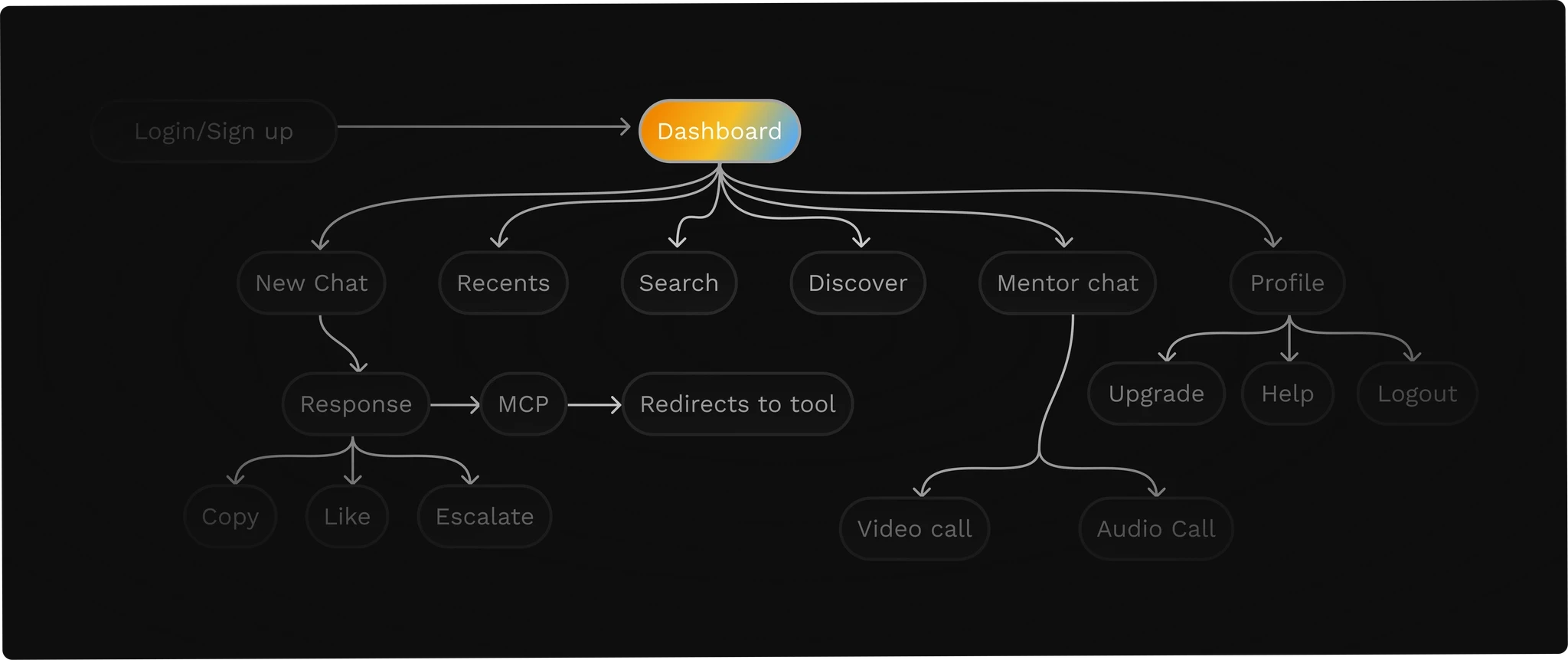
Wireframes came before any visual polish — simple, structured layouts using standard UI patterns so the product would feel immediately legible, with information organized predictably before I touched color or type.
Visual direction
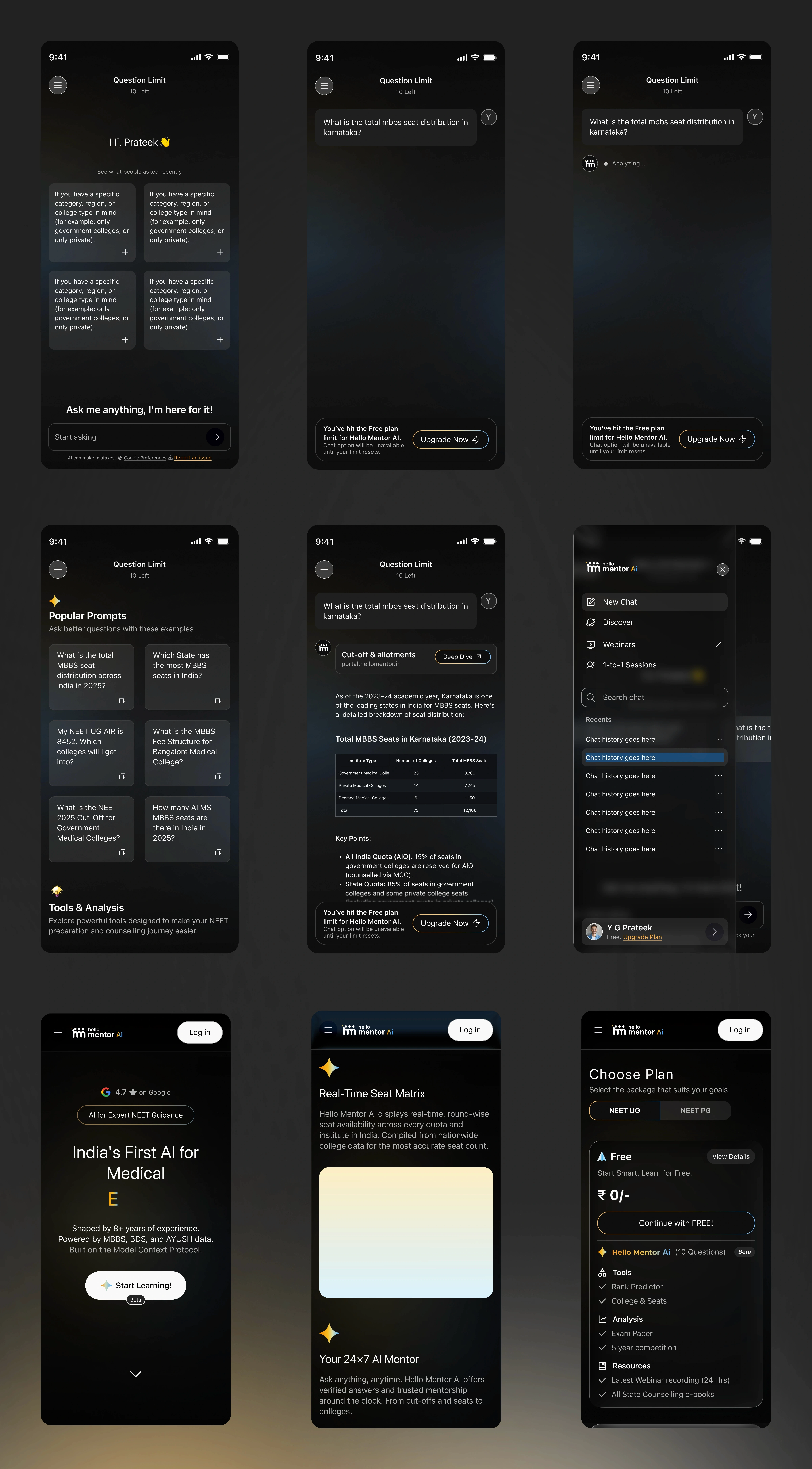
I built a moodboard early to lock down the emotional tone before touching UI: minimal layout, a strong typographic hierarchy, and calm, low-saturation color to reduce cognitive load and reinforce a sense of reliability rather than novelty. That led to a dark-first, mobile-first interface — deliberately choosing a dark theme to keep visual noise down and keep attention on the guidance itself, with familiar chat interaction patterns and clear content hierarchy that scales across chat, tool results, and prompt libraries.
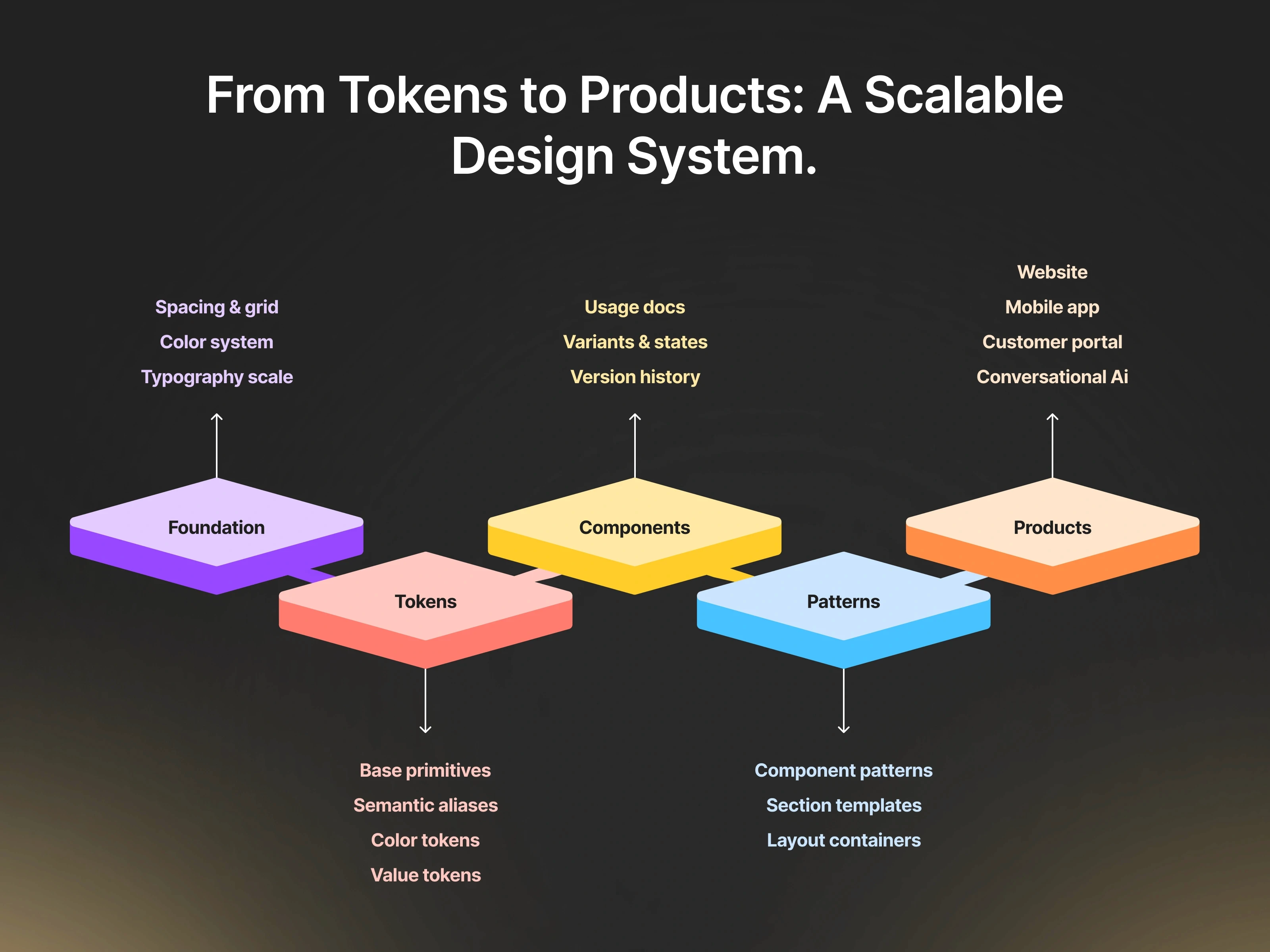
Underneath the visuals sits a full production design system I built across light and dark modes — an iOS-style “liquid glass” surface treatment, a consistent type scale (SF Pro for interface text, Inter and Roboto for longer-form content), and documented color tokens — so a screen designed in month one and a screen designed in month six still read as the same product.
Strategic AI interaction decisions
A handful of interaction patterns came directly out of the research rather than convention:
Real-time response streaming and a brief, honest “Thinking” state — no fake instantness, no unnecessary explanation either.
Conversational memory, so a student doesn’t have to re-establish context every message.
Intelligent follow-up suggestions for a student who doesn’t fully know what to ask next.
MCP-based tool execution for anything structured — a cutoff, a fee — instead of letting the model guess.
Escalation to a human counselor designed as a first-class path, not a last resort, for the judgment calls that genuinely need one.
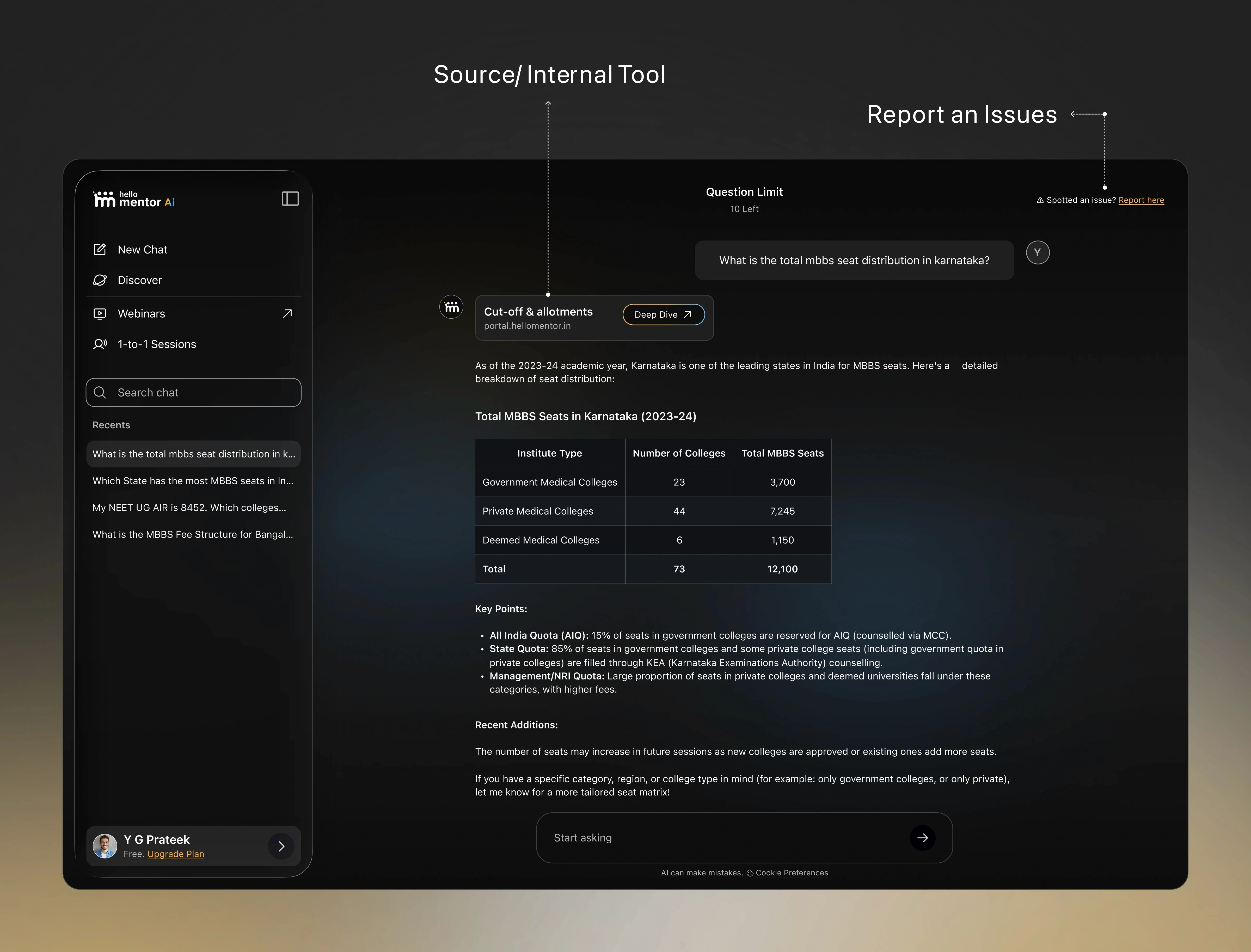
Source-grounded answers, with a visible source reference and inline thumbs up/down plus a persistent “Spotted an issue? Report here” control — because for a product where a wrong answer can cost a family a year, making it trivially easy to flag one was as important as trying to get it right in the first place.
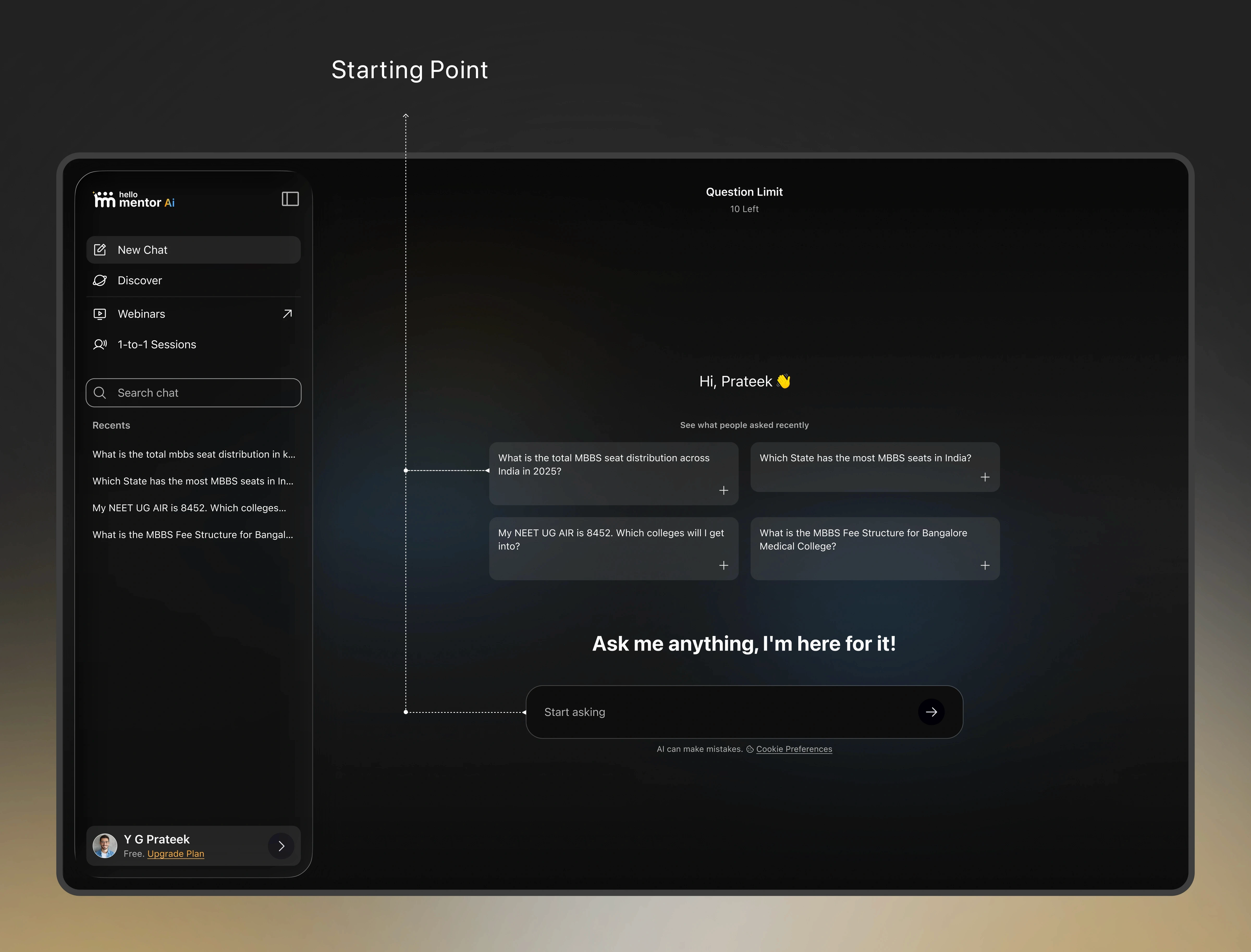
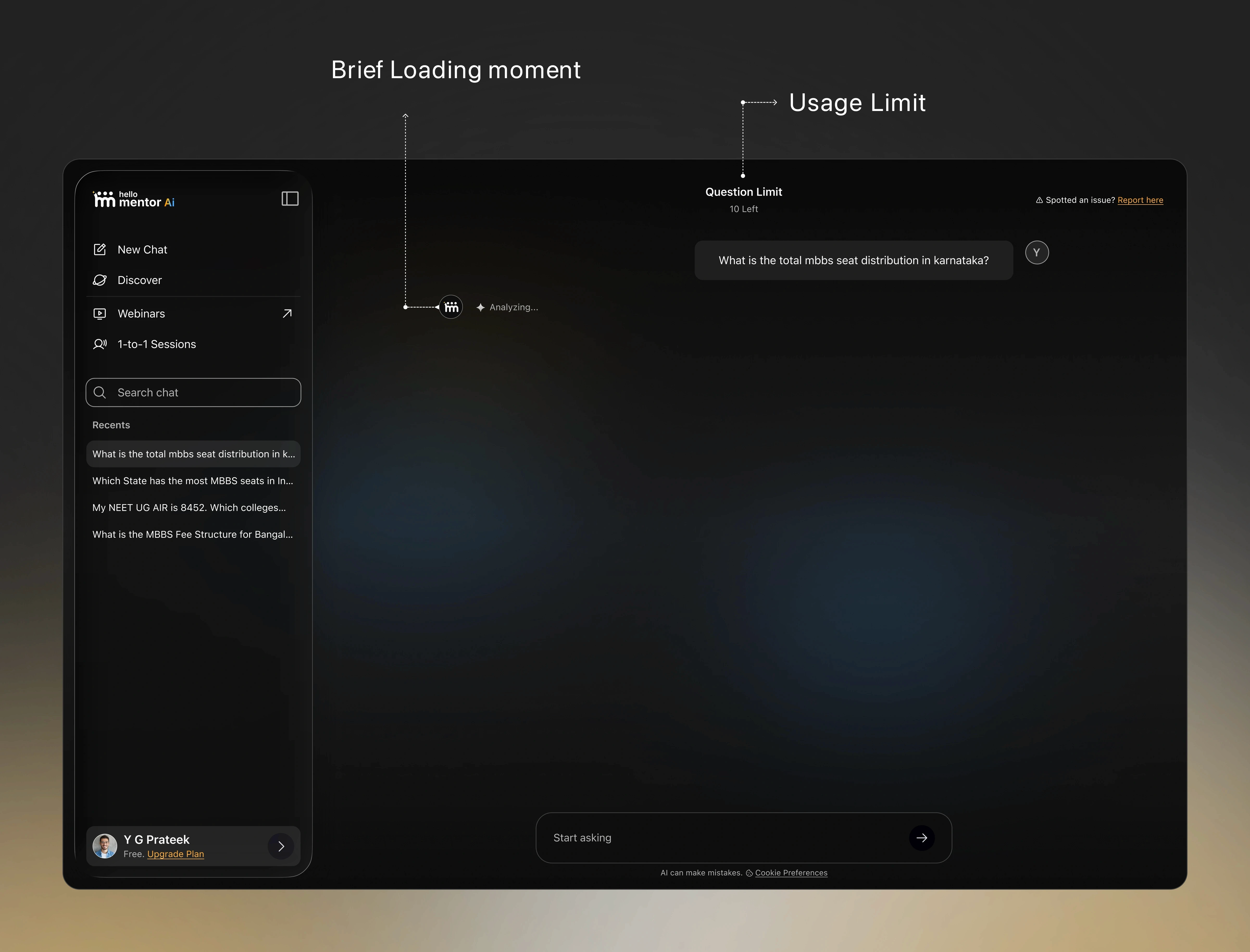
Usage limits are visible up front too — a running Question Limit counter sits at the top of the screen rather than hiding in account settings, since the moment a student actually needs this product is often the worst possible time to discover they’re capped out.
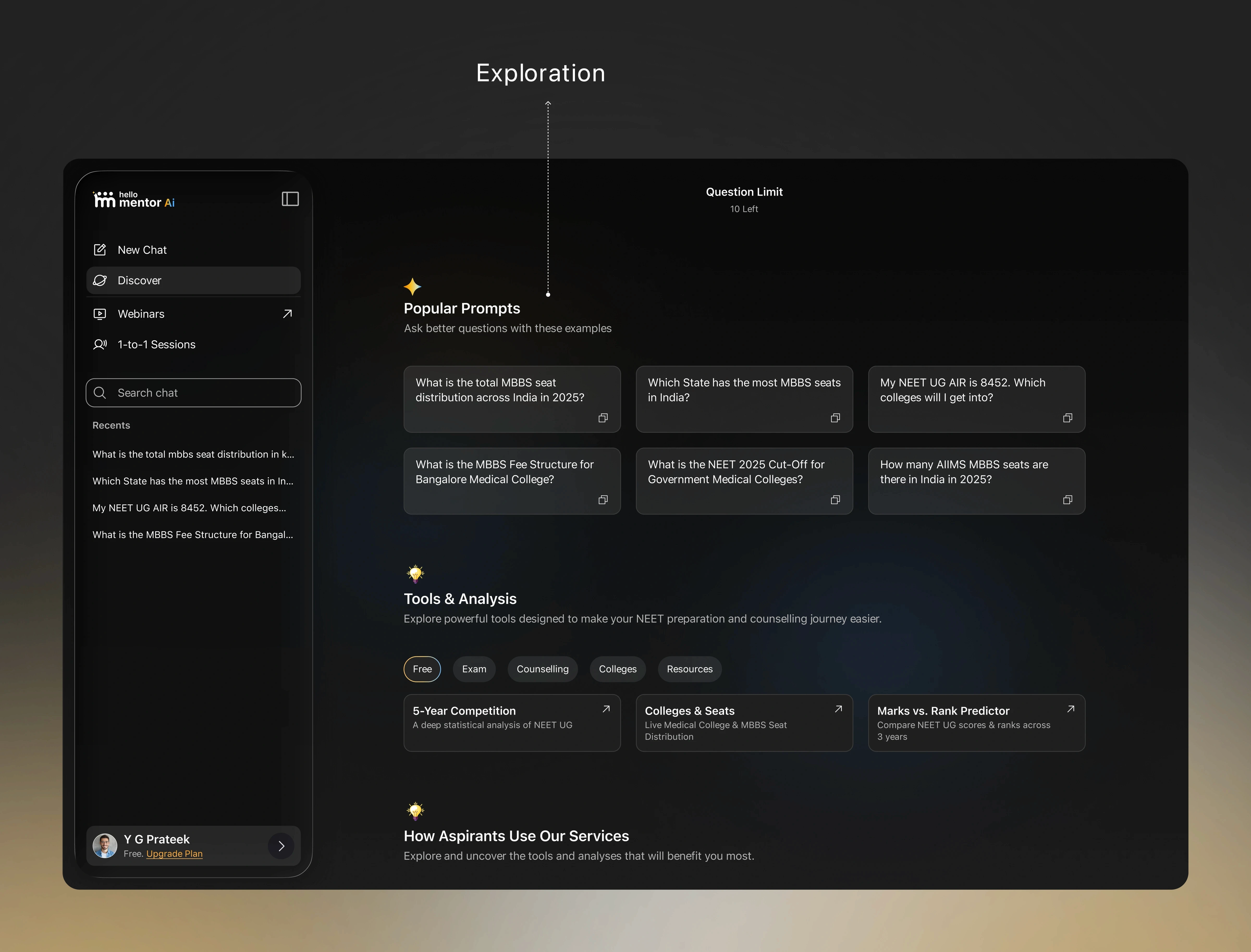
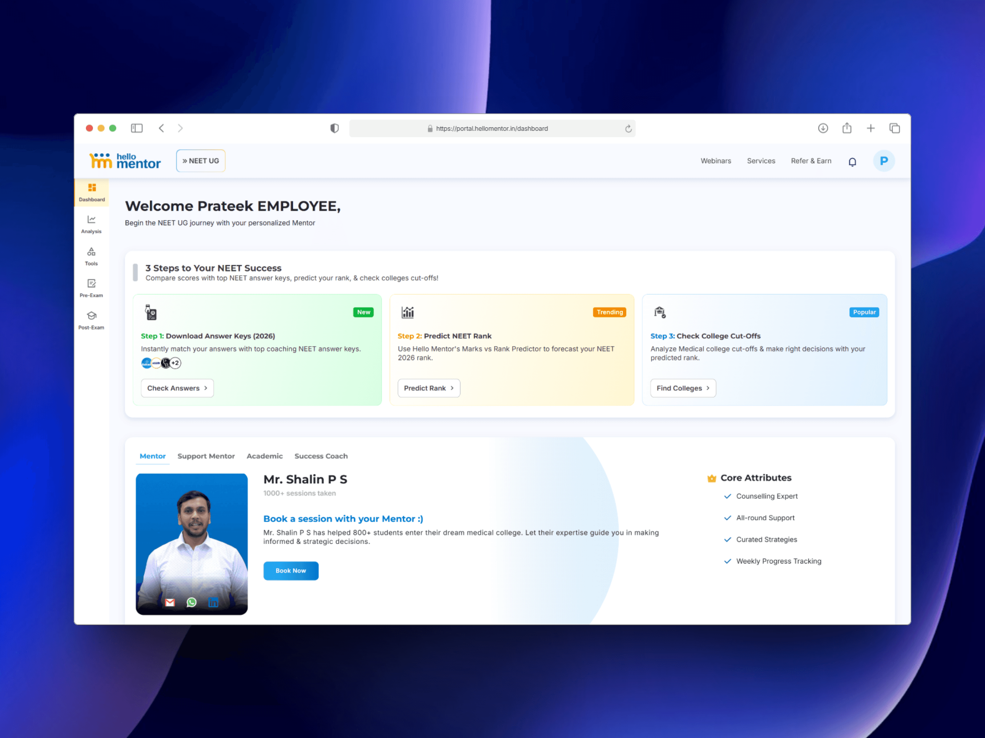
For students who don’t yet have a specific question, Discover works as a second entry point — a Prompt Library of real community questions alongside a Tools & Analysis suite (5-Year Competition trends, Colleges & Seats, and a dedicated Marks vs. Rank Predictor), organized across Free, Exam, Counselling, Colleges, and Resources tabs. The rank predictor tool is the direct product answer to the discrepancy problem that started this whole project — some questions need a structured comparison surface, not a sentence.
Impact
2× increase in sales following the redesigned platform and AI launch
60% increase in platform engagement
5,000+ sign-ups to the AI product in its first month
35–70% improvement in task completion across redesigned flows
Informational queries now resolve instantly at scale, freeing mentor time for complex, judgment-based guidance instead of repetition
Post-launch: what the data told us, and what broke
Shipping wasn’t the end of the design work. Staying close to engineering after launch — sitting in on their architecture reviews rather than just receiving specs — is how the M.S. Ramaiah quota-mixing issue surfaced concretely: the same college’s cutoff swinging from ~6,900 to ~73,000 between rounds because an NRI-quota result mixed with general-merit results with no quota or year grouping enforced. It’s being fixed at the data layer now — grouped by quota, defaulting to the latest year — and the UI-side responsibility is mine: make sure year, quota, and category are always visible next to a number, not just available if you dig for it.
Future roadmap
The underlying system is maturing from an MVP into a production-grade AI pipeline: hybrid search that combines vector similarity with keyword-based ranking, a reranking step to surface genuinely relevant results, and proper evaluation (precision, recall, faithfulness, hallucination checks) with production observability — the kind of rigor a product only needs once it’s actually carrying real trust, not just demonstrating a concept.
The change most relevant to my side of the work is the shift from a single LLM call to a multi-step agent that can call several tools mid-conversation — check a cutoff, then fees, then seat availability — before composing one answer. That changes what “loading” should mean. I’m designing the interface to surface the agent’s steps as they happen (“Checking M.S. Ramaiah cutoff… checking fees…”) instead of a blank spinner, so a student can see what an answer is actually grounded in rather than taking it on faith — the same principle from the start of this project, applied one layer deeper.